The look I am going for is white counter, dark floors, dark sink..
Ikea - EKBACKEN
Countertop, white marble effect/laminate
At first I wanted a White sink, but the more I thought about it the more I realized it would
look dirty all the time and be a real pain. Also, a lot of the kitchens I liked on Pinterest had
white Counters, with non-white or stainless sinks, and it didn't look odd or distracting.
White, on the other hand, instantly made a faux marble countertop look Farmhouse, a style
I like in other people's homes but not for myself everyday.
So I chose:
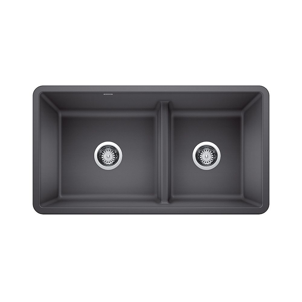
The Blanco PRECIS U 1.75 LOW DIVIDE,
Offset Double Bowl, Undermount Kitchen Sink
in the granite-composite "SILGRANIT"
In the colour Cinder
$754.00
PRECIS kitchen sinks are made in Canada and Germany
Heat, scratch and stain resistant
Non-porous surface is food-safe and easy to clean
Undermount installation
Minimum cabinet size: 36"
Only 12 lbs
Bowl Depth 9.5"
So I would need a 10" reaching faucet to hit the
centre of the bowl.
Silgranit is a granite composite material containing 80% granite dust.
It has the look and feel of stone, but it's much more durable and easier to maintain.
Silgranit highly resistant to heat, scratches, and stains.
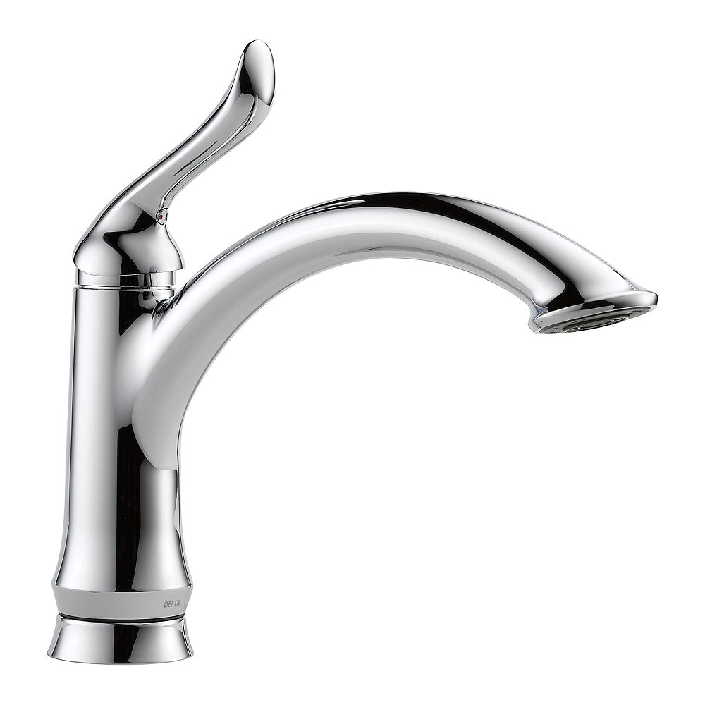
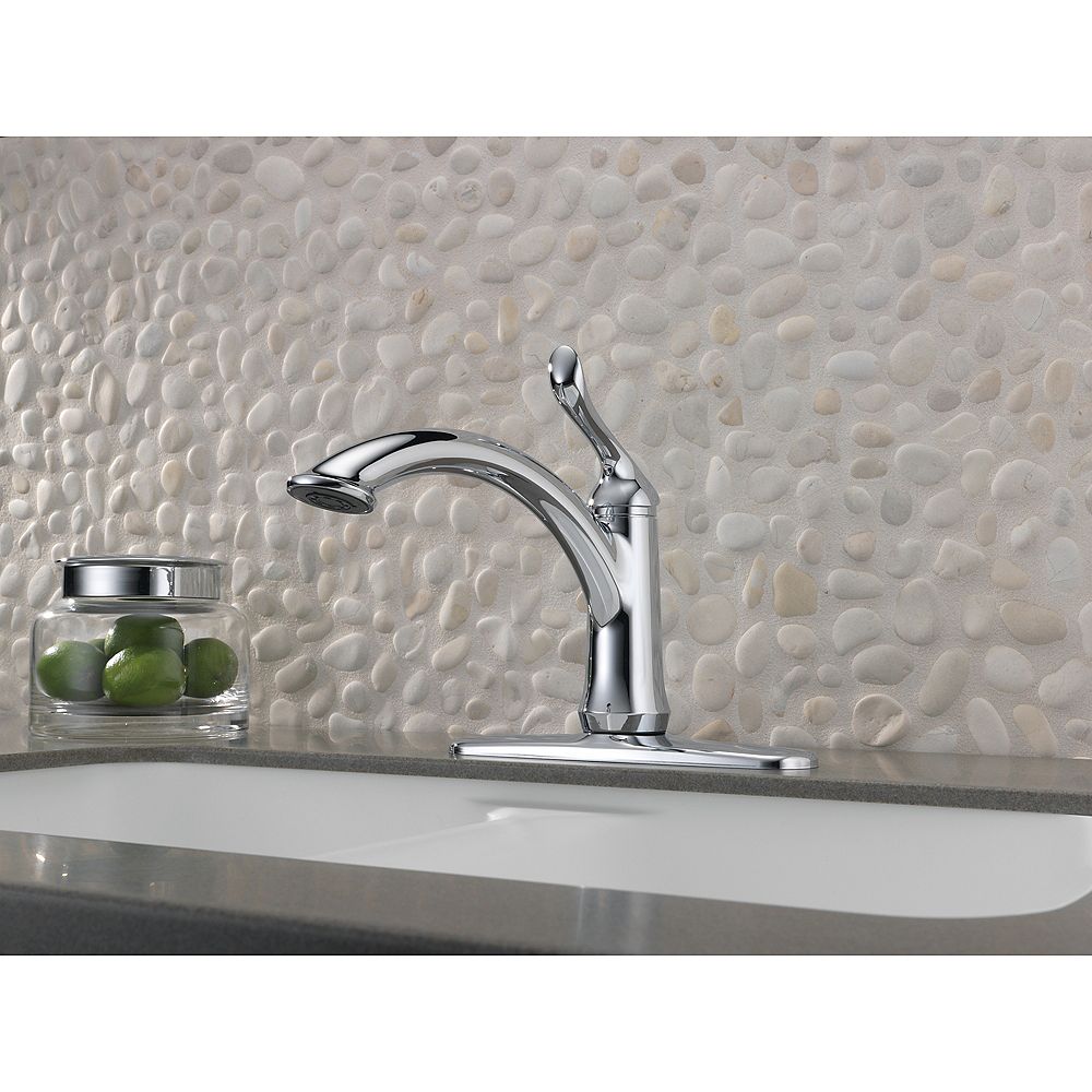
I like the idea of a chrome faucet w/ this dark grey sink.
The look of the below one feels right.
Delta - Single Handle Kitchen Faucet
$155.99 / each
Assembled Depth 12.16"
Assembled Height 11.38"
Spout Reach 9.8"
Make certain you are choosing a faucet with adequate height to accommodate the items
you'll be washing or filling. The higher the spout, the easier it is to fit tall pots under it for
filling or cleaning. If you have a shelf above your sink or a wide window ledge,
a tall faucet may not fit.
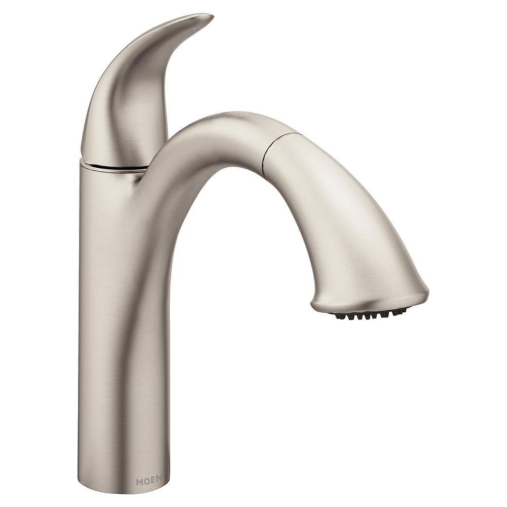
MOEN Camerist Single-Handle Pull-Out Sprayer
Kitchen Faucet in Spot Resist Stainless
$397.00
Assembled Depth 9.13"
Assembled Height 10.88"
Spout Reach 9.13"
As for flooring in the kitchen, I want a dark wood or faux wood floor.
I also like the look of a slightly Wider plank.
I like faux wood flooring because I find that it stays warmer underfoot than real wood does.
Here are some great faux options:
7-2/3 in. Wide x 50-5/8 in. long planks
7mm thick
Laminate Flooring (24.17 sq. ft. / case)
Authentic wood look finish
15-year residential warranty against wear, fade and stain
$1.19 /sq. ft.
Covers 24.17 sq. ft.
$28.76 /case
I think over 5" wide planks would look silly in a kitchen.
Too much like a barn. Also, apparently minimum 12mm thick flooring is the best bet.
The below is the better option all around.
Home Decorators - Hand-Scraped Tanned Hickory
5-9/32 in. Wide x 47-17/32 long planks
12mm thick
Color/Finish: Brown/Hand-Scraped Wood Texture laminate
$1.79 /sq. ft.
Covers 12.19 sq. ft.
$21.82 /case
Limited lifetime residential warranty
Thicker flooring of any kind means reduced sound migration, better insulating properties,
softer footfalls, and better bridging of subfloor imperfections.
This is why 12mm laminate flooring is so highly sought after.
I love how dark it is, while still looking warm.
Cabinets:
I've looked at A LOT of photos of kitchens. A Lot.
The completely Modern cabinet w/ zero surface interest does not
interest me. And the beveled, traditional cabinets feel quite Grandma's house.
What always appeals to me lately are cabinets with thin, recessed panels, aka a flatter
version of a Shaker, as well as any narrow, flat applied moulding.
Both shown below:
I think these look the best when these details are not on ALL of the cabinets.
For instance: Below the upper drawers are flat with no detail.
Another cabinet detail that I think can look great in moderation is what
I just learned is called Mullion cabinet. That is when a glass pane is in the
centre of the cabinet instead of wood. The panes can have decorative mullions
(the wood between the panes of glass), or it can be replaced w/ a
different material, like mesh, shown below:
If you have beautiful glassware or candlesticks etc that you don't use often,
to have a couple standard glass Mullion cabinets, lit from inside, with glass shelves,
would look so beautiful.
Or to put mirror on the inside of mullion cabinets makes them
look like jewellery!:
I AM having difficulty selecting a colour for the cabinets.
I think white looks too stark and traditional, but I don't
want a bright colour and I don't want dark.
Here are some options:
(remember, we are doing a white countertop, dark brown wood floor, dark grey sink,
& a silvery grey stainless steel faucet. Also, the window frame will be black.)
This one below is beautiful & I think my top choice.
(after already doing all the below "research")
So a pale, pale gray.
Pale Putty
I tried to colour match these w/ a paint swatch, & funnily enough,
they suggest a grey and dark brown to go with it. :D
A browner version - less feminine.
Uhh...on second thought ..
I don't like putty with chocolate floors AT ALL:
😟
hmm or maybe it's just the high gloss floors throwing me off..
Just a single open shelf on top made out of the counter material.
Like this:


No comments:
Post a Comment
Don't be a jerk